Insight Report Basics
Overview
Audience Insights reports show the distribution of profiled audiences (selected users and baseline users) across a specific attribute or behavior.
Many reports display controls that enable you to highlight different aspects of the data:
- The Sort By control enables you to specify sort order of data displayed in the report. Most reports can be sorted by affinity, selected users, or baseline users.
- The Count control enables you to specify the number of module features displayed in the report.
- The Chart Type control enables you to specify the chart type used to plot the data. Most reports can be displayed in three types of charts: horizontal bar charts, vertical bar charts, or stacked bar charts.
Report Types
Note
Don’t expect every data graph under every category to contain useful data for certain ad-hoc audiences. You will need to experiment to identify insights of interest based on what makes sense for your advertiser.
Audience Insights supports the following report types:
| Report | Description |
|---|---|
| Demographic Insights | Demographic insights show the distribution of selected audiences and baseline audiences across various Demographic category modules. To learn more, Demographic Insights. |
| Purchases Insights | Purchase insights show the distribution of selected audiences and baseline audiences across various Purchase category modules. To learn more, Purchase Insights. |
| Behavior Insights | Behavior insights show the distribution of selected audiences and baseline audiences across various Behavior category modules. To learn more, Behavior Insights. |
| Travel Insights | Travel insights show the distribution of selected audiences and baseline audiences across various Travel category modules. To learn more, Travel Insights. |
| Search Insights | Search insights show the distribution of selected audiences and baseline audiences across various Search category modules. To learn more, Search Insights. |
| Content Insights | Content insights show the distribution of selected audiences and baseline audiences across various Content category modules. To learn more, Content Insights. |
| Mobile Insights | Mobile insights show the distribution of ad-hoc audiences (selected users and baseline users) across mobile modules. To learn more, Mobile Insights. |
| Performance Insights | Performance insights show the distribution of selected audiences and baseline audiences across various Performance category modules. To learn more, Performance Insights. |
| Top Insights | Top Insights reports enable you to compare profiled audiences across multiple performance modules. Each module is represented by a distinct report that enables you to view the affinity of profiled selected users and baseline users. To learn more, Top Insights. |
Each Audience Insights category is organized into multiple modules that represent an audience segment.
Sort Report Data
The Sort By control enables you to sort the data displayed in the report to highlight a subset of consumers.
In general, data may be sorted by affinity, by selected users, or by baseline users.
Sort by Affinity
Sorting reports by affinity enables you to identify module features where the affinity rate of the selected users exceeds or falls short of the affinity rate of the baseline audience.
If you sort a Purchase Categories (Level 1) report by affinity in descending order, the report displays those purchase categories with highest affinity score: that is, the greatest gap between the selected audience affinity and baseline audience affinity.
In the example, the report indicates that the audience of selected users shows the greatest affinity in the Sporting Goods purchase category.
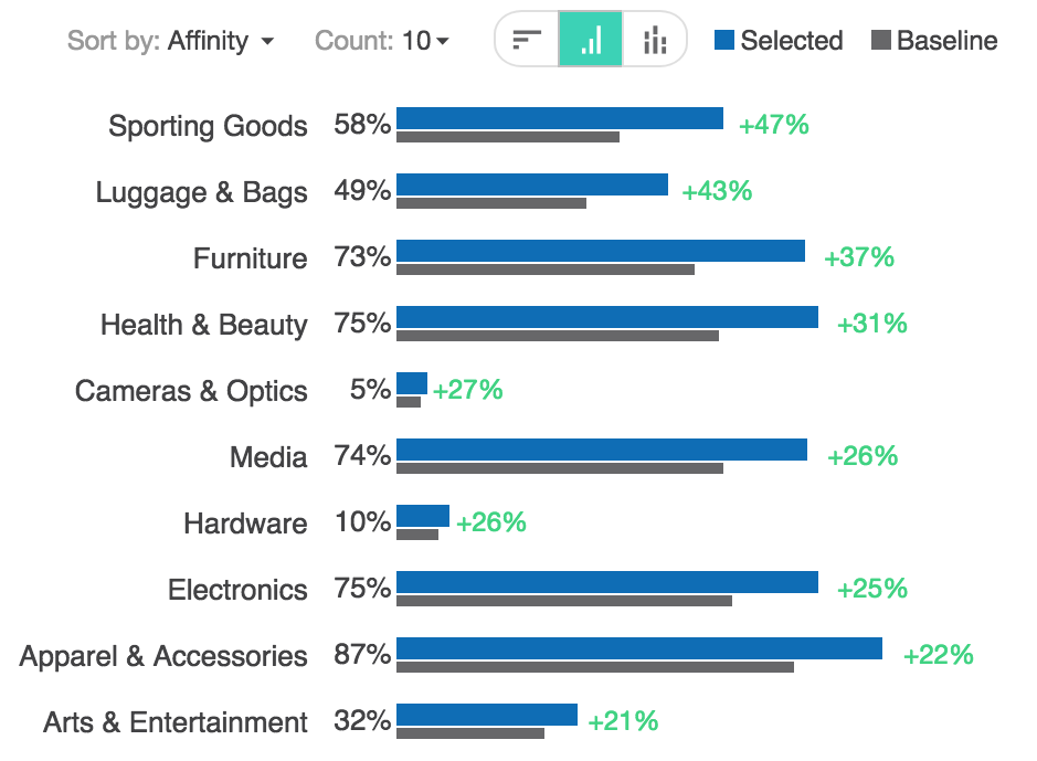
Fig. 10 Report Data Sorted by Affinity in Descending Order
Alternatively, you can sort by affinity in ascending order to view those purchase categories with the lowest affinity score. A low affinity score indicates that a greater ratio of the baseline audience demonstrates an affinity with a particular feature. To learn more about affinity, see Affinity.
Sort by Selected Users
Sorting reports by selected users enables you to identify module features that match the greatest percentage selected users.
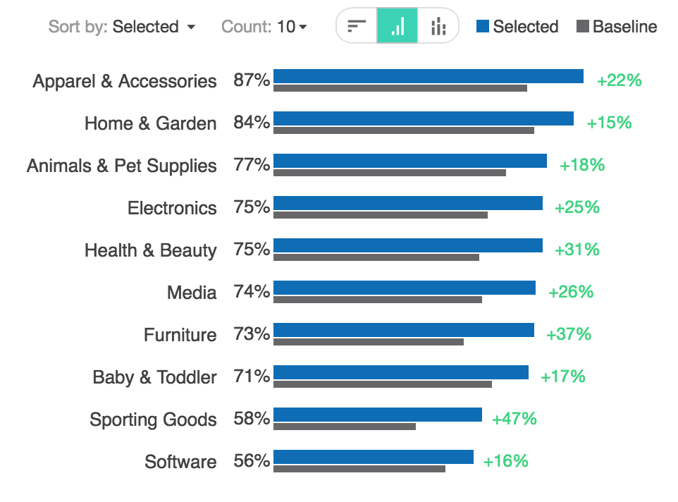
Fig. 11 Report Data Sorted by Selected Users
Sorting by selected users will enable you to identify those module features that are characteristic or atypical of the members of a selected user audience.
Sort by Baseline Users
Sorting reports by baseline users enables you to identify module features that match the greatest percentage baseline users.
Fig. 12 Report Data Sorted by Selected Users
Sorting by baseline users will enable you to identify those module features that are characteristic or atypical of the members of a baseline audience.
Sorting by selected users or sorting by baseline users and sorting by affinity are not the same. Sorting by affinity enables you to identify module features where the nature of the selected audience differs from that of the baseline.
Chart Types
Some reports may be displayed using a variety of chart types.
Modal controls in the report panel enable you to switch between charts. Each chart type is represented by a unique icon. The selected chart type is always displayed in green.

Horizontal Bar Chart
Horizontal bar charts show the distribution of selected audiences and baseline audiences across a category of data. To learn more, see Horizontal Bar Chart.

Vertical Bar Chart
Vertical bar charts show the distribution of selected audiences and baseline audiences across a category of data. To learn more, see Vertical Bar Chart.

Stacked Bar Chart
Stacked bar charts show the distribution of selected audiences and baseline audiences across a category of data. To learn more, see Stacked Bar Chart.

Treemap Chart
The treemap chart displays rectangles to show relative proportion of the distribution of audiences across Yahoo site and device pairings in relative size. To learn more, see Treemap Chart.

Table Chart
The table chart shows distribution of selected and baseline audiences across Yahoo site and device pairings by percentage. To learn more, see Table Chart.
Vertical Bar Chart
The vertical bar chart enables you to compare the distribution of selected audiences with that of baseline audiences. Selected audiences (in blue) and baseline audiences (in black) are displayed side-by-side for comparison.
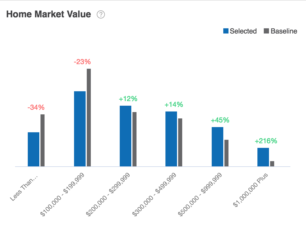
Fig. 13 Vertical Bar Chart
The x-axis specifies the categories compared and the y-axis shows the number of consumers within each audience that falls within that category. The number of consumers that match the attribute is represented visually by the length of rectangles (bars) of equal width.
Data displayed in horizontal bar charts may be displayed in vertical bar charts and stacked bar charts as well.
Horizontal Bar Chart
The horizontal bar chart enables you to compare the distribution of selected audiences with that of baseline audiences. Selected audiences (in blue) and baseline audiences (in black) are displayed side-by-side for comparison.
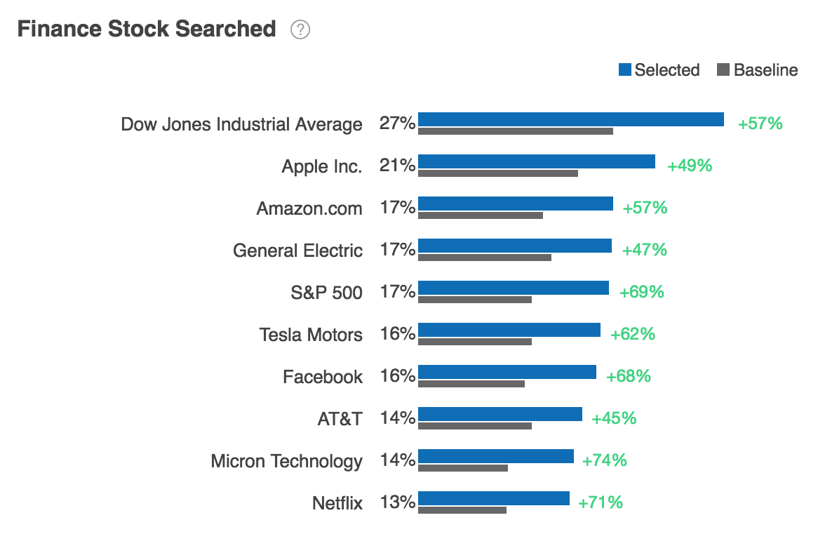
Fig. 14 Horizontal Bar Chart
The y-axis specifies the categories compared and the x-axis shows the number of consumers within each audience that falls within that category. The number of consumers that match the attribute is represented visually by the length of rectangles (bars) of equal width.
Data displayed in horizontal bar charts may be displayed in vertical bar charts and stacked bar charts as well.
Stacked Bar Chart
The stacked bar chart enables you to visualize the degree to which the number of selected audience members differs from a baseline audience across a category of data.
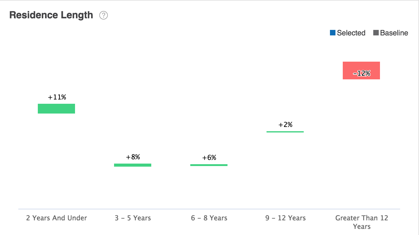
Fig. 15 Stacked Bar Chart
The x-axis specifies the categories compared and the y-axis shows the percentage by which the number of selected audience members exceeds (in green) or or falls short of (in red) the number of baseline audience members.
Data displayed in stacked bar charts may be displayed in vertical bar charts and horizontal bar charts as well.
Daily Trend Chart
The daily trend chart displays information for each day in the previous month. In the App Activity Daily Trend report, the chart shows consumer mobile app activity in the previous thirty days.
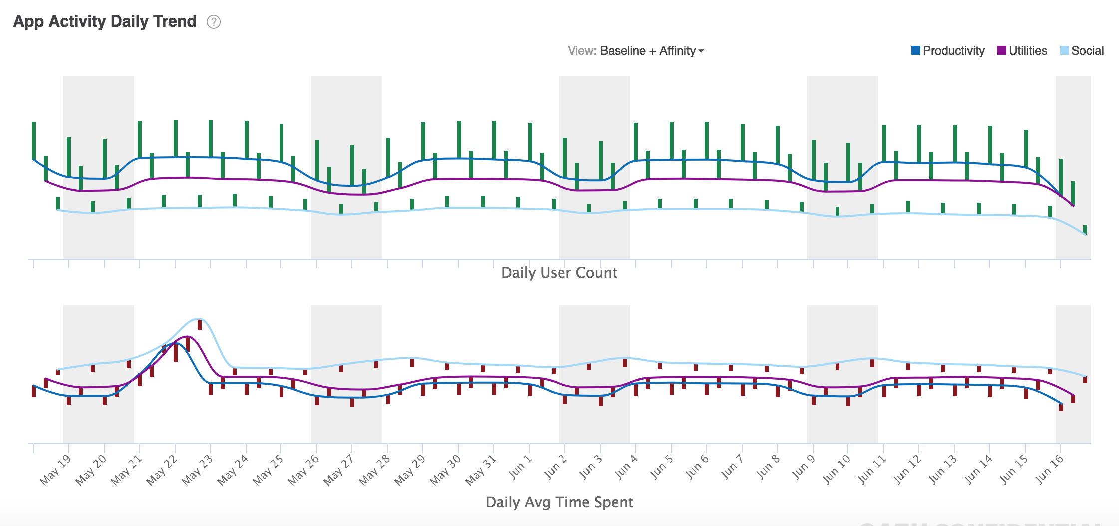
Fig. 16 Daily Trend Chart
The x-axis represents the previous thirty days of App Activity Trend data for the profiled audiences. The y-axis represents either the percentage users or the percentage of time those users spend in a given day.
Intra-Day Activity Trend Chart
The intra-day activity trend chart displays the percentage of selected audiences or baseline audiences using apps during the hours of each day.

Fig. 17 Intra-Day Activity Trend Chart
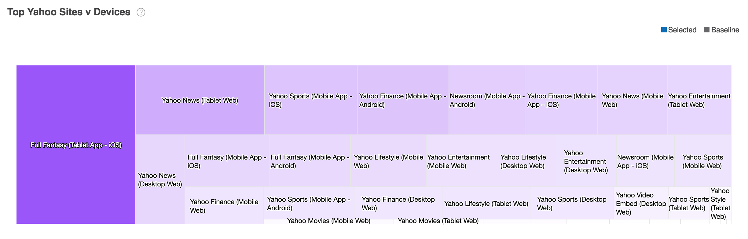
Treemap Chart
The treemap chart displays rectangles to show relative proportion of the distribution of audiences across Yahoo site and device pairings in relative size.
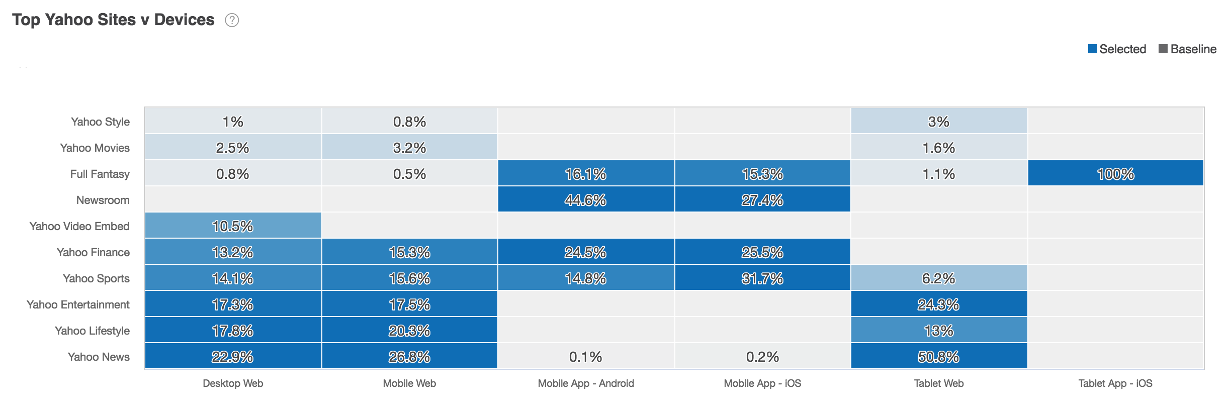
Fig. 18 Treemap Chart
Data displayed in treemap charts may be displayed in table charts as well.
Table Chart
The table chart shows distribution of selected and baseline audiences across Yahoo site and device pairings by percentage.
Data displayed in table charts may be displayed in treemap charts as well.
Affinity
In Audience Insights, affinity always measures the percentage by which the ratio of selected users exceeds or falls short of the baseline ratio.
- A positive number indicates that the ratio of consumers in the selected audience demonstrating certain behaviors or characteristics is higher than that of the baseline audience.
- A positive number indicates that the ratio of consumers in the selected audience demonstrating certain behaviors or characteristics is higher than that of the baseline audience.
If more selected users demonstrate a certain behavior or characteristic, you might think that there is a positive correlation between those two characteristics. The higher the number, the greater the correlation.
In the example, both selected users (84%) and baseline users (73%) have demonstrated an interest in Home & Gardening. Audience Insights identifies a significant positive correlation between these two audiences (15%).
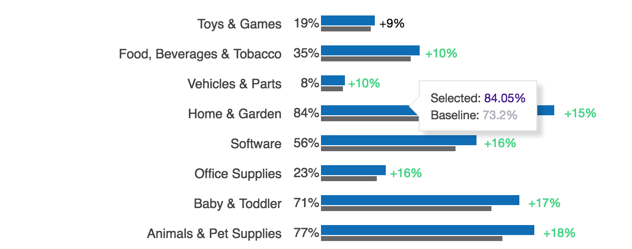
Fig. 19 Affinity Analysis of Two Audiences
Affinity measures the percentage difference (positive or negative) between the selected users and baseline users and reflects the likelihood that the selected users will exhibit the behaviors or characteristics of all users.
Affinity measures the percentage difference between the selected users and baseline users for that specific filter category. This number (+/-), reflects the likelihood that the selected users will exhibit the behaviors or characteristics of all users.